

A3 Problem-Solving – How To Tell the Story On One Sheet of Paper.
I was chatting with a few contacts recently, and the topic of A3 Problem Solving came up. It got me thinking, and I figured it was worth doing a quick overview of what it is and, more importantly, why it’s so surprisingly effective.
We’ve all been there, haven’t we? Staring at a 40-page report that’s landed in our inbox, complete with dense paragraphs, endless charts, and a conclusion that, if we’re honest, we’ll probably just skip to. Or maybe we’re the ones writing it, spending days crafting the perfect document, only to suspect it will be skimmed at best and ignored at worst. There’s a kind of corporate theatre to it all. We create these huge, comprehensive documents to prove we’ve done the work, but do they actually help anyone think better or make better decisions? Most of the time, I’d argue they don’t. They bury the essential story under a mountain of information.
This is where a beautifully counter intuitive idea comes into play. The idea that you can achieve more clarity, better thinking, and stronger alignment with less. Specifically, with a single sheet of A3 paper.
Problem solving, at its heart, is a thinking-intensive activity. But the act of writing things down, of structuring our thoughts, can massively amplify the quality of that thinking. It forces us to move from a jumble of ideas in our heads to a logical, coherent narrative. The A3 process is a framework designed to do exactly that. It guides us to document key information and decisions at each step of a problem-solving journey. This document then becomes a living thing, something that can be shared with others to get their input, to challenge our assumptions, and to build a shared understanding before any final decisions are made.
It sounds simple, and in many ways it is. But its power lies in a discipline that most of our modern reporting has lost.
So, Why A3? A Quick History Lesson
Let’s get the most obvious question out of the way first. Why the name A3? It’s almost comically practical. The methodology was pioneered at Toyota, a company famous for its relentless focus on efficiency and continuous improvement. Back in the day, much of their communication across different sites, and even different countries, was done by fax. And A3, which is roughly 29 by 42 centimetres, just happened to be the largest size of paper that could reliably fit through a fax machine.
It’s an amazing little detail, I think. A world changing management philosophy constrained and shaped by the technology of the time. It’s a perfect reminder that innovation doesn’t always come from some grand, abstract vision. Sometimes it’s born from very real, very mundane limitations. The size constraint wasn’t an afterthought; it was a foundational element that forced a particular kind of discipline. You couldn’t just keep adding pages. You had to be concise. You had to make every word and every chart count.
This little piece of history is crucial because it gets to the very soul of the A3 report. The key fundamental is not the rigid format, the specific boxes you have to fill in, or the finesse with which you create fancy drawings and charts. To be honest, a beautifully designed A3 that reflects shallow thinking is completely useless. The real point, the thing that makes it all work, is the communication process it enables.
The A3 is the physical manifestation of a problem solving journey. It’s a tool that underpins a deeper process of critical thinking and collaborative decision making. It allows the most critical information about a problem, from its background to the proposed solution, to be distilled onto a single page. This can then be shared across the business, allowing others to quickly evaluate the thought process behind it. It becomes a formal means for requesting support and advice, which in turn aligns everyone in the organisation on how the problem will be tackled and moved forward. It transforms problem solving from a solo activity into a team sport.
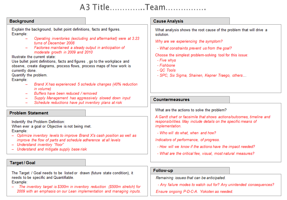
Anatomy of an A3 Report
If you look at a typical A3 template, you’ll see it’s laid out to tell a story, flowing logically from left to right and top to bottom. While the exact layout isn’t set in stone, as I mentioned, the format is not the main point, most successful A3s follow a structure that mirrors the Plan Do Check Act, or PDCA, cycle. It guides you through a systematic process, ensuring no critical steps are skipped.

Let’s break down the typical sections.
- Title or Theme: This is the headline. It should concisely define the problem you’re trying to solve. Something like, “Reducing Customer Wait Times in the Support Queue” or “Improving the Accuracy of Monthly Financial Forecasts.” It needs to be clear and specific, framing the entire document.
- Background / Current Condition: This is where you set the scene. Why is this problem important? Who does it affect? What is the business impact? This section isn’t about opinions; it’s about facts. You need to go and see the process for yourself, what lean practitioners call genchi genbutsu. You should include data, charts, or simple diagrams to show the current state. What does the process look like right now? What is the performance? This section grounds the problem in reality.
- Goal / Target Condition: If the last section was about where we are, this is about where we want to be. What does success look like? The key here is to be incredibly specific and measurable. “Make things better” is not a goal. “Reduce average customer wait time from 4 minutes to 90 seconds by the end of Q3” is a goal. It should be a clear, unambiguous statement that leaves no room for interpretation. This target becomes the benchmark against which you’ll measure your success.
- Root Cause Analysis: To me, this is the absolute heart of the A3. It’s where the real thinking happens. It’s also the step that is most often rushed or skipped entirely in traditional problem solving. We see a problem, we jump to a solution. The A3 process forces you to slow down and ask one simple, powerful question, over and over again: Why? This is the famous “5 Whys” technique. You state the problem and ask why it’s happening. Then you take that answer and ask why that is happening. You continue drilling down until you move past the symptoms and uncover the true root cause. Often, the cause you end up with is completely different from what you initially suspected. This section might include a fishbone diagram or a simple bulleted list, but its purpose is to show a clear, logical chain of reasoning from the problem to its source.
- Countermeasures / Proposed Actions: Only after a thorough root cause analysis can you begin to think about solutions. Notice the word “countermeasures,” not “solutions.” It’s a subtle but important distinction. A countermeasure is a specific action designed to address a specific root cause. This section should directly link back to your analysis. If a root cause was “Inadequate training on the new software,” a countermeasure would be “Develop and deliver a mandatory 2 hour training module for all team members.” You’re not just throwing ideas at the wall; you’re proposing targeted interventions.
- Implementation Plan: This is where the plan becomes real. An idea without a plan is just a wish. For each countermeasure, you need to define who is responsible, what specific tasks need to be completed, and when they need to be done by. It’s a simple table: What, Who, When. This creates accountability and turns a good idea into a concrete project.
- Follow Up / Verification: How will we know if our countermeasures actually worked? This section closes the loop. It defines the metrics you will track, which should be directly related to the goal you set at the beginning. It also specifies when and how you will check the results. Are you going to review the data weekly? Monthly? This step ensures that the A3 isn’t just a one time exercise but the start of a continuous improvement cycle.
- Results and Learning: Finally, once the plan has been implemented and enough time has passed, you document what actually happened. Did you hit your target? If so, great. What did you learn that you can apply elsewhere? If not, why not? This is just as valuable. An A3 that shows a failed experiment is not a failure; it’s a source of incredible learning. This final section captures that knowledge for the rest of the organisation.
The Real Magic: A Tool for Thinking and Talking
So, that’s the structure. But if you just download a template and fill in the boxes, you’re missing the point entirely. The document is just an artefact; the real value is in the thought process and the conversations it creates.
First, it’s a tool for clarifying your own thinking. The constraint of the single page is a powerful focusing agent. You can’t waffle. You can’t hide behind jargon or bury weak arguments in long paragraphs. You have to be brutally economical with your words. The process of trying to fit a complex problem onto one sheet forces you to simplify, to prioritise, and to make sure your logic is sound. You can literally see the connections between the problem, its root cause, and the proposed fix. It makes your thinking visible, not just to others, but to yourself.
Second, and perhaps more importantly, the A3 is a catalyst for communication and collaboration. In a typical corporate setting, a proposal or report is often worked on in isolation and then presented in a big meeting, a “big reveal” moment. This often puts people on the defensive. They poke holes in it, ask questions the presenter isn’t prepared for, and the whole thing can descend into conflict or get bogged down in debate.
The A3 process flips this on its head. The A3 is meant to be a draft, a conversation starter. The idea is to take your messy, pencil drawn A3 and walk it around to the key stakeholders. This process is sometimes called nemawashi in Japanese, which translates literally to “turning the roots.” It’s about carefully building consensus from the ground up. You show it to your manager, to the people who work in the process, to colleagues in other departments. You don’t present it; you ask for their help. “Here’s what I’m thinking, what am I missing?” “Does this data look right to you?” “What are your thoughts on these countermeasures?”
This approach does a few wonderful things. It enriches the A3 with diverse perspectives, making the final outcome much stronger. It builds buy in from the very beginning, because people feel they have been part of the solution finding process. And it fosters a culture of coaching. A good manager doesn’t just approve or reject an A3. They ask probing questions. “Why did you stop your root cause analysis there?” “How confident are you that this countermeasure will achieve the full target?” They coach the author to think more deeply, turning every problem into a development opportunity.
How to Start Your First A3
If any of this sounds interesting, my advice is simple: just try it. Pick a small, nagging problem that you’re familiar with. It doesn’t have to be a multi million pound production issue. It could be something as simple as “Team meetings consistently run over time” or “The process for submitting expense reports is confusing.”
And please, for your first few attempts, follow the original author’s advice and use a pencil and a physical piece of paper. I know it sounds old fashioned, but there’s a reason for it. A PowerPoint or a fancy software template can create a false sense of finality. It looks polished, so we become reluctant to change it. A pencil and paper, on the other hand, feels temporary and iterative. It gives you permission to be messy, to erase things, to scribble in the margins, and to focus purely on the quality of your thinking, not on your graphic design skills.
Walk through the sections one by one. Go and observe the current condition. Talk to the people involved. Spend a good amount of time on the root cause analysis. Don’t just accept the first answer that comes to mind. Keep asking why. Then, once you have a rough draft, go and talk to someone about it. See what they think. Your first one won’t be perfect, and that’s completely fine. The goal is to practice the thinking discipline, not to create a masterpiece.
Over time, you’ll find that the structure becomes second nature. It becomes an internal mental model for how you approach any problem, whether you’re formally writing an A3 or not.
A Way of Thinking for Everyone
While the A3 report was born on the factory floors of Toyota, its application is truly universal. It’s a mistake to see it as just a manufacturing tool. At its core, A3 thinking is simply a structured, collaborative, data driven approach to problem solving. And what part of a business couldn’t benefit from that?
Think about it.
A marketing team could use it to analyse why a particular campaign underperformed, digging into root causes related to audience targeting, messaging, or channel selection, rather than just shrugging and moving on to the next thing.
An HR department could use it to tackle a problem like high employee turnover in a specific team. Instead of jumping to solutions like a pay rise, they could use the A3 process to uncover deeper issues related to management style, workload, or career development opportunities.
An IT team could use it to finally solve a recurring network outage, systematically investigating the root cause instead of just rebooting the server every time it happens.
Even at a strategic level, a simplified A3 format can be used to propose a new business initiative, outlining the current market condition, the proposed goal, the analysis behind the proposal, and a high-level implementation plan, all on one page for senior leaders to review.
The principles are always the same: Go see for yourself. Grasp the current situation. Analyse down to the root cause. Build consensus around effective countermeasures. And follow through to ensure they work.
In the end, the A3 process is a powerful antidote to the complexity and information overload that plagues so many of our organisations. It’s a call to return to a more disciplined, more thoughtful, and more human way of solving problems. It reminds us that clarity doesn’t come from adding more information, but from stripping away everything that isn’t essential.
It proves that sometimes, the most powerful and persuasive story you can tell is the one that fits on a single sheet of paper.
More Blog Posts
The Push vs Pull Debate: Why Volume and Variability Make the Call
The Anatomy of a Value Stream Map: How to Identify Non‑Value‑Added Time

From Firefighter to Coach: 5 Traits That Define True Lean Leadership

Takt Time vs. Cycle Time: Understanding the Heartbeat of Your Factory

The £50,000 Question Kevin Didn’t Ask: Why Your Lean Program is Failing in Silence

3 Daily Habits That Shift Your Factory from Reactive Chaos to Proactive Control


To leave me a message or book a return call at a time that suits you